 |
Interactive Floor Plan & Room Descriptions
We have gathered together room descriptions and photos of the Kips Bay 34th Annual Decorator Show House and put them all in an interactive floor plan.
Scroll down to click on a room number on the 3D-floor plan below to move quickly to your desired show room description below. To get back to the floor plan after reading description, click your browser’s “back” button.
—OR—
Use the Key to Designer’ Rooms below and click on a designer’s room number. Return to the Key to Designer’ Rooms with your browser “back” button.
Key to Designers’ Rooms:
(Number in left column corresponds to room number in floor plan below.)

The Room Descriptions
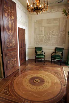
Red Branch's "Foyer After Robert Adam." Photo by Newsday.com.
Room 1: “Foyer After Robert Adam”
Red Branch Decorator Imaging
Red Branch Decor introduced an innovative new digital imaging technique in the foyer of the Show House that simulates intricate relief plaster work, applying images of trompe l’oeil architecture, digitally produced marquetry for floor, door and furniture applications, decorative neo-classical wall murals and a faux polychrome plasterwork ceiling. The style is influenced by old-world and Greco-Roman periods but the technique is brand-new and can only be seen in the Show House.
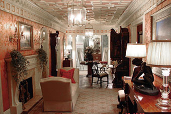
Barbara Ostrom's “Long Gallery.” Photo by Donna Duncan.
Room 2: “The Long Gallery & Library for World Travelers”
Barbara Ostrom Associates
This former entry tunnel for carriage horses is now a gracious gallery reminiscent of an 18th Century English Manor House with elaborate Hyde Park mouldings, columns and a fireplace; an imported antique parquet flooring from a dismantled English estate and silk damask walls. Furniture includes an early 18th Century Normandy desk, a grand 19th Century English library table and an 18th Century tall case—or grandfather—clock. The library just off the gallery features cherry paneling with a hand-rubbed finish, an ancient map mural painted on the ceiling and another offering a faux view through a palladium window.
Room 2A: “Entranceway”
Robin Sacks Decorative Painting
Robin Sacks Decorative Painting completed a five layer paint finish with Venetian plaster, metallic paint and a fluid look that changes depending on the angle from which they are viewed. A mixture of plasters was applied for added dimension and reflection to create a modern, yet traditional feel. The look was inspired by ironwork on the outside of the house and the wood beamed ceiling on the second floor.
“Room With a View” by Susan Gutfreund. Photo by Newsday.com.
Room 3: “Room with a View”
Susan K. Gutfreund
In what was the barn, in the early years of this residence, Susan Gutfreund created trompe l'oeil magic by using decoarative scenic panels of fabric as windows in the otherwise woindowless room, achieving the perfect statement of the theme of her room.
“The Collector’s Study” by Katina Arts-Meyer Ltd. Photo by Newsday.com.
Room 4: “The Collector’s Study”
Katina Arts-Meyer Ltd.This comfortable space prominently features works of art from all over the world and an original cabinet to indulge a well-traveled collector who enjoys displaying his gathered treasures including original signed copies of “In Darkest Africa” and an ejection seat from a Canberra Nuclear Bomber circa 1955. Marble 19th Century Egyptian sphinxes guard the room; a rare Persian Bidjar carpet lies underfoot; and a Louis XVI mahogany commode/desk is placed in the corner. A bronze-finial Napoleonic sofa Baroque round table and walnut Regence commode provide French historical pieces as well.
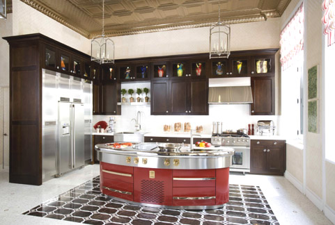
St. Charles of New York kitchen with Molteni Cooking Island.
Room 5: “Romancing the Kitchen”
St. Charles of New YorkElectrolux Icon appliances are the stars of this show, particularly the custom-designed lipstick red Molteni island, with a griddle, refrigerator drawers, a cook-top and two sinks. The cabinets are custom walnut and stainless steel, and in addition to the disguised pull-out pantries and dishwasher, they also showcase artwork and complement the milk glass countertops which are impervious to heat and stains of any kind. A dramatic patterned satin brass ceiling with oversized coves balances mosaic marble flooring, both of which set off the kitchen’s 600 square, 8-foot windows and 14-foot ceilings. The space also boasts a furnished entertainment area with a curvaceous Louis XIV chairs at a plexiglass dining table and an antique mirrored console table.
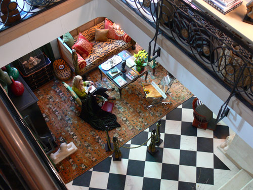
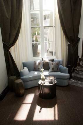
Room 6: “A Landing for Living and Lounging”
Eric Cohler DesignEric Cohler and Jeffery McCullough ensured that the Show House’s landing is not just a pass-through, but invites lingering with its hand-printed aurora gold dust wallpaper, limestone mantle, eclectic array of furniture including a 1960’s waterfall table and orange tea tables from Bungalow 5; and a striking wall of photographs centered by a black and white of James Dean. On the opposite wall, window treatments mimic the shape of the frames with patterned sheers and dramatic chocolate brown curtains.
Room 7: “The Living Room”
Katherine Newman DesignThe oak mantle is a centerpiece in this room, hand-carved with white and yellow gold flowers after a necklace, set in a quartzite frame. Leather-lined bookshelves are filled from floor to ceiling and positioned near oversized house renderings by Peter Cebulak. Four large chandeliers with crystal panels anchor the room and three wool art deco rugs divide the space into groupings, where the mix of furniture showcase the best of French 40’s design. The modern form is juxtaposed with circular elements disbursed throughout the room including an elephant trunk table, a dining table with rounded chairs and two Moroccan poufs.
Room 8: “The Great Room”
Robert Mishaan DesignThis young modern library layers items from different eras and combines silver grass cloth walls with rich classic swag draperies that boast leather piping and a modern pattern. Displayed are a Baccarat vase, a 1st Century Roman statue of Apollo a hand-carved bowl made from a single piece of white jade adorned with an18-carat gold, dragon-shaped base and a slate sculpture that doubles as a fireplace screen.
Campion Platt’s Mr. Woo's Lab. Photo by Newsday.com.
Room 9: “Mr. Woo“s Lab”
Campion PlattThis “urban sophisticate’s” oasis near the kitchen achieves a cocoon-like feeling with luxurious Jim Thompson silk, a stretched luminous ceiling and a daybed alcove. A Lucite desk is positioned near lacquered shelves and accessories including jade discs and Buddhas from Tui Pranich.
Room 10: “The Little Gallery”
Joel Allen DesignThis bright room welcomes a changing art collection—this version with themes and colors of India. The ceiling is painted a soft purple, the color of morning and evening skies over India; and draperies are salmon-pink fabric panels that start at the center of the ceiling and are pulled to the corners of the room. A wall mural consists of the colors of India and mouldings were finished with a raw, hand-rubbed effect.
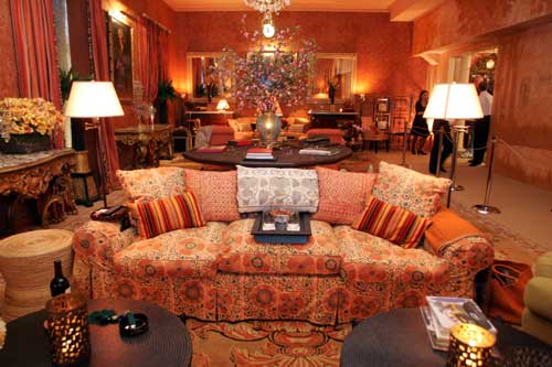
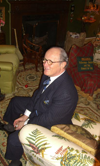
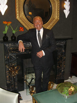
Mario Buatta in his "Sitting Room." Photo by NY Social Diary.
Room 11: “The Sitting Room”
Mario Buatta Inc.This homage to dogs is evident in the classic dog and animal prints sprinkled throughout the room, accented by dramatic, hand-painted faux marble mouldings, moss green velvet upholstered walls, a gold paper ceiling and two striking topiaries in the windows, framed by heavy, pale yellow Regency draperies. A 1920 art screen wrapped in leather features images of dogs and the theme is repeated in an 1820 chair hand-carved with dog-heads. In the far corner is a 1920’s Martin Franck Belgian writing table, inlayed with yellow tortoiseshell. Underfoot, an early 19th Century rug is laid over beige polka dot Brussels weave carpet.
Room 12: “Garden Room”
Kondylis Design and Costas Kondylis
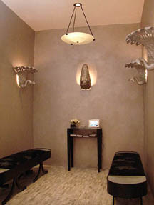
and Partners Architects, LLPThis natural light-filled atrium provides a visually serene resting point between rooms and features two Belgian linen benches, an Alhambra palace-inspired.
"Buona Notte" by Charles Pavarini III. Photo by Donna Duncan.
Room 13: “Buona Notte”
Charles Pavarini III Design Associates, Inc.Velvet and damask walls highlight the angled framework of this room, which was added to offer depth and warmth. The headboard is upholstered and bordered with high-tech LED lighting that gradually changes color sets the mood in this bedroom, which also boasts original wood floor from a French château set in a herringbone pattern. The bed chamber with luxurious fabric cascading around the bed is reminiscent of the Renaissance period, and lighting includes a 1918 Art Deco sconce by the entrance and a French Art Deco chandelier from the 1930’s in the bed chamber. A rock crystal and amethyst lamp sits beneath a hand-painted celestial mural of zodiac signs in the bay window area, and an 1800’s bust is mounted above the door.
Objet d’art in Thom Filicia's "Modern Times." Photo by Newsday.com
Room 14: “Modern Times”
Thom FiliciaThis room is described as “urban jungle meets great organic influences” and features handcrafted paper fiber charcoal wallpaper; bronze linen window treatments with gold silk and wool Serenity; collector’s furniture pieces adorned with reeds, birds, snails and snakes as well as dramatic sculptures of whale jaw and rib bones. An 18th Century Swedish settee creates a distinct juxtaposition with an original contemporary Cazanovia sofa; and a completely mechanical Triannale floor lamp completes the eclectic design.
Photo of Larry Laslo in his room by NY Social Diary.
Room 15: “What Is . . . Black, White, and Suite”
Larry Laslo DesignsThis master bedroom prominently features a Philippe Starck zenith black Baccarat chandelier with over 250 crystals, valued at $68,000. Matching sconces are displayed in the bathroom, along with silver sink fixtures shaped like octopi and sea shells, and black and white photographs of Picasso. On either side of the grey tweed bed are original Matisse drawings, and an 18th Century Regency gilt wood octagonal convex mirror hangs on the opposite wall. A wall-to-wall short goat fur rug adds to the warmth and softness.
Room 16: “Vanity Fair”
Larry Laslo Designs for Walker Zanger
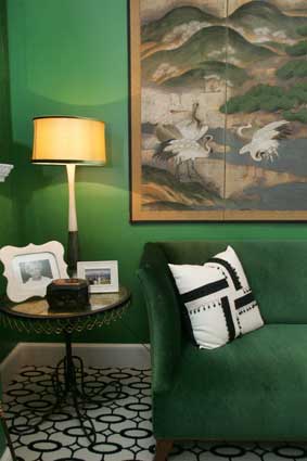
Sherrill Canet’s "The Lounge." Photo by Newsday.com.
Room 17: “The Lounge”
Sherrill Canet Interiors, Ltd.Emerald green walls are softened with glaze top coat and offset by the striking black and white Wilton rug in an elliptical pattern, designed by the artist. A 1940’s Murano chandelier hangs overheard and 18th Century Japanese screen contribute to this secluded hideaway that features an 1840 Biedermeier dresser, two contemporary Carl Fudge silk screen prints and a “Foo dog” Chinese sculpture to bring good luck.
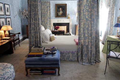
"The Boudoir" by Charlotte Moss. Photo by Newsday.com.
Room 18: “The Boudoir”
Charlotte Moss Interior Design
The focal point of this room, which is inspired by the Frenchwoman Pauline de Rothschild, is a simple iron Italian bed appointed with embroidered linens. To combine elements from different periods and styles, Napoleon III, cotton velvet chairs sit near the fireplace, along with a Louis XVI chaise, a new iron chair and antique Chinese porcelain. 18th Century French watercolor paintings are mixed with recent black and white photographs of Versailles. And, de Rothschild’s loves of books and writing are reflected throughout the room.
John Landrum Bryant’s “The Sanctuary.” Photo by Newsday.com.
Room 19: “The Sanctuary”
John Landrum BryantThis bathroom is meant to be an intimate, tranquil, private space to relax at the end of the day. The room blends textures, materials, design techniques, colors and lighting to create a celestial atmosphere. The shower walls combine pearl ceramic with “oxygen” glass tiles, which produce the effect of pooled, shimmering water. The mosaic floor features Italian Sienna Silver Travertine and the original bench seat is upholstered in mocha supreme suede, hand-stenciled using a 400-year-old Japanese Katazome technique. Nearby, a dining table is covered in a single piece of alligator skin and is set with hand-painted plates and embroidered napkins.
Room 20: “Loft Bedroom”
Kenneth Hockin InteriorsDowntown meets uptown in this bedroom, which has been called Soho on East 75th Street. Plush Tibetan carpet layers over painted concrete floor, grass cloth lushly covers the walls and an iron four-poster bed emerges as the focal point. A rusted industrial base is repurposed here as a coffee table and a collection of 1940’s vintage hat molds are displayed to offset the natural materials.
Room 21: “Petit Salon”
Christopher Maya Associates, Inc.Royal blue upholstered walls in wool and rich chocolate brown draperies are accented by a center fireplace with a limestone mantle, all of which contribute to the warm, intimate room, which was designed to be an inner sanctuary: a place for intimate gatherings and solitary reflection. Leather-wrapped bookcases and silver nail heads along the top of the walls add texture, as do the Louis XVI mohair chairs and silk sari lampshades. The focal point is a Wooton painting from 1798.
Room 22: “A Sunny Boudoir ”
Tonin MacCallum A.S.I.D., Inc.Using creative furniture layout and hand-blocked, leopard-patterned fabric on the walls, this boudoir addresses a number of structural issues and provides architectural definition with a coral grosgrain ribbon. The Spring colors were taken from a classic Rose Cummings chintz print, including aqua on the bed canopy ceiling and the room’s ceiling. A Burmese teak “tete a tete” conversation chair set centers the room, whose furniture spans the 18th to 20th Centuries.
Room 23: “The Reading Room”
Shaver/Melahn StudiosAnother tranquil space for reading and reflection, this room features “niveaux de gris,” a palette of grays, and a Tibetan Odegard carpet. A life-sized Roman statue creates a dynamic focal point in the room, and a chandelier illuminates the corner. The walls were finished in a Venetian stucco to add depth to the room. Botanical photographs also add an element of nature.
Room 24: “A Room of His Own”
Schermerhorn Interior DesignThis small nook (21’ X 7’) features a 700 watt light fixture above that is covered by stretched barrisol white material, giving the feel of a faux skylight in a windowless room. Contemporary art at the far end stops the eye while mirrors offer the illusion of vistas beyond. Along with ivory walls and floor, the uplifting feeling of natural light from above is created. An Italian sculptural cabinet and antique oriental carpet complete the warm feel.
“Tapestry” by Greener by Design. Photo by Newsday.com.
Terrace: “Tapestry”
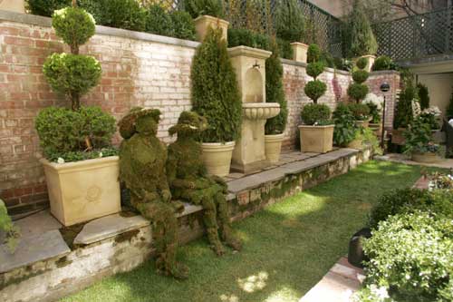
Greener by DesignGreener by Design created a “greenroom” garden room on the second floor terrace called “Tapestry” after the contemporary room themes that are woven into the outside space. It has the feel of a medieval courtyard and features an architecturally-correct knot garden that can be seen from all the facing rooms as well as the patio area of the garden. It is planted and latticed vertically to enhance the courtyard sense and picks up a pattern from the second floor landing ceiling. The “greenroom” doubles the life of roof membranes, insulates it from heat and cold and is beneficial to the environment.
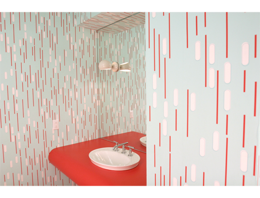
Guest Bathroom
twenty2. Photo from www.twenty2.net.
 |
| |
| |
|||
| |
| |
|||
| |
| |
|||
Subscribe to our free and
extremely informative newsletter. |
||||
All pages of this website and content therein are copyrighted by DesignIntuit, 2000–2006.
Use of any content from this site or publications is strictly prohibited without the written consent of DesignIntuit, 2006.


